
It was the finish line of the JiPay app in terms of UI/UX design. All the flows were worked out and all the screens were finally moved to the green frames in a Hi-Fi folder, which was proudly considered “Approved” by the clients.

👀 Product overview: JiPay is a fintech app which enables employers to manage helpers (in Asia, this is the name given to domestic workers such as the nannies, cleaners and chefs). In its MVP, the app focuses on expense management and allows employers to track and control their helpers' spending through a dedicated pre-paid card.
But what design can be considered successfully completed without a ‘durability test’ — the users’ feedback? How do we get their “Approved”?
This is where usability testing comes into play. Let's look at how we did it with JiPay and how it impacted our design.
☝️ Do not confuse usability testing — having individuals experience a product’s functionality — with A/B testing — experimenting with two or more versions of a page or screen to see which is most effective.
Types of Usability Testing
There are a number of different methods to test app usability:
- It can be either moderated or not moderated;
- Either in-person or remote;
- Digital or analogue — in the latter we use paper cards with the names of contents and features. Users are asked to sort them in a particular order which explains the logic of the app.
While we are not going to dwell on each separately, we want to tell you about our experience with JiPay — the method we selected and the insights we gained.
Keeping our objectives in mind, we decided that we would prefer a moderated conversation with the users. Since the target audience is on the other side of the globe, the tests would have to be remote.
It was extremely important for us to see their reactions, hear their comments and concerns, as well as to get involved when they experience difficulties navigating the app and ask questions about what they are looking for or expect to see on a particular screen.
We wanted it to be a dialogue, not just a list of checkboxes showing task completions vs. failures.
Preparing Remote Usability Testing for JiPay
Just for your reference: we did not have a coded app at the moment of usability testing. We had just finished the design and had created a clickable prototype in Figma.
So, we started to prepare for moderated remote interviews. JiPay’s founders arranged meetings with 8 potential users who use the services of one or more helpers.
First, we created a list of the app’s features such as ordering a card, assigning a helper for the card, topping up the card, etc. Then we wrote down the expected actions for every single step.
We formulated all these features and expected actions into one user testing scenario in a logical sequence with questions/tasks like these:
- You hired a helper, her name is Christina, how would you invite her to the app?
• Expected action: order a new card, click ‘Invite Helper’ button at the card, share the code with Christine.
- Imagine that Christina is leaving and you have found a new helper, Stephanie, how would you replace Christina with Stephanie?
• Expected action: remove Christine either via Subscription or Helpers page, order a replacement card, click ‘Invite Helper’ button, share the code with Stephanie.
- Where would you check whether your subscription plan has been changed or not?
• Expected action: go to Profile, go to Subscription Details.
We had a list of about 40 tasks which represented one cohesive scenario where the employer managed their helpers in the app.
Next we created a clickable prototype according to the scenario. In some cases the completion of a task was possible through more than one avenue (for example, changing the helper’s name was possible both from Helper’s page and Card Information page). So we provided both flows in the prototype and made notes on which flow the user preferred.
And finally, the interview itself. All the calls were arranged in GoogleMeet and we asked users to join the call from their mobile phones, to open the Figma link we had sent to the chat, and to share their screen.
On the other side of the screen we were playing the following roles:
- One person was a moderator who was guiding users through the tasks.
- Another person was making notes to document whether everything was clear for the user at each step or whether they had experienced some difficulties.
Ideally, these two roles should be different people in order not to be distracted and miss some details.
It is important to have the designer who created the prototype and knows every screen from A to Z on the call. They can provide quick help if the flow goes wrong.
Guide to Usability Test Interviews
- We thanked the user for agreeing to participate in the usability testing.
- Introduced the team and briefly reminded the user what the product is for.
- Learned more about the user by asking them about their occupation, the city they are from, etc.
- Explained the goal of the usability testing and emphasised that we were going to test the app, not the users! It’s important for us to put the users at ease and make sure they remain calm if they experience any difficulties.
- And finally, we told about the rules of the test — namely that it was a prototype, not a real app, and all the fields would be prefilled when clicked, that user’s name would be Jenny Lee, that we would not be able to give any clues and would answer all the questions in the end.
✍️ Making notes is very important! Having good notes to look back on makes it a lot easier to analyse problem areas and see a clear summary of the results.

Analysing our Usability Test Results
Once we finished our user interviews, we were able to move onto the final — and most important — step of the usability testing process. Time to process all the collected data and improve the product design according to user feedback.
We created another table where we included the most challenging tasks that were formulated as problems, indicated their frequency and importance, and then we worked out possible solutions to each specific problem.

🥁 Changes to JiPay Design after Testing
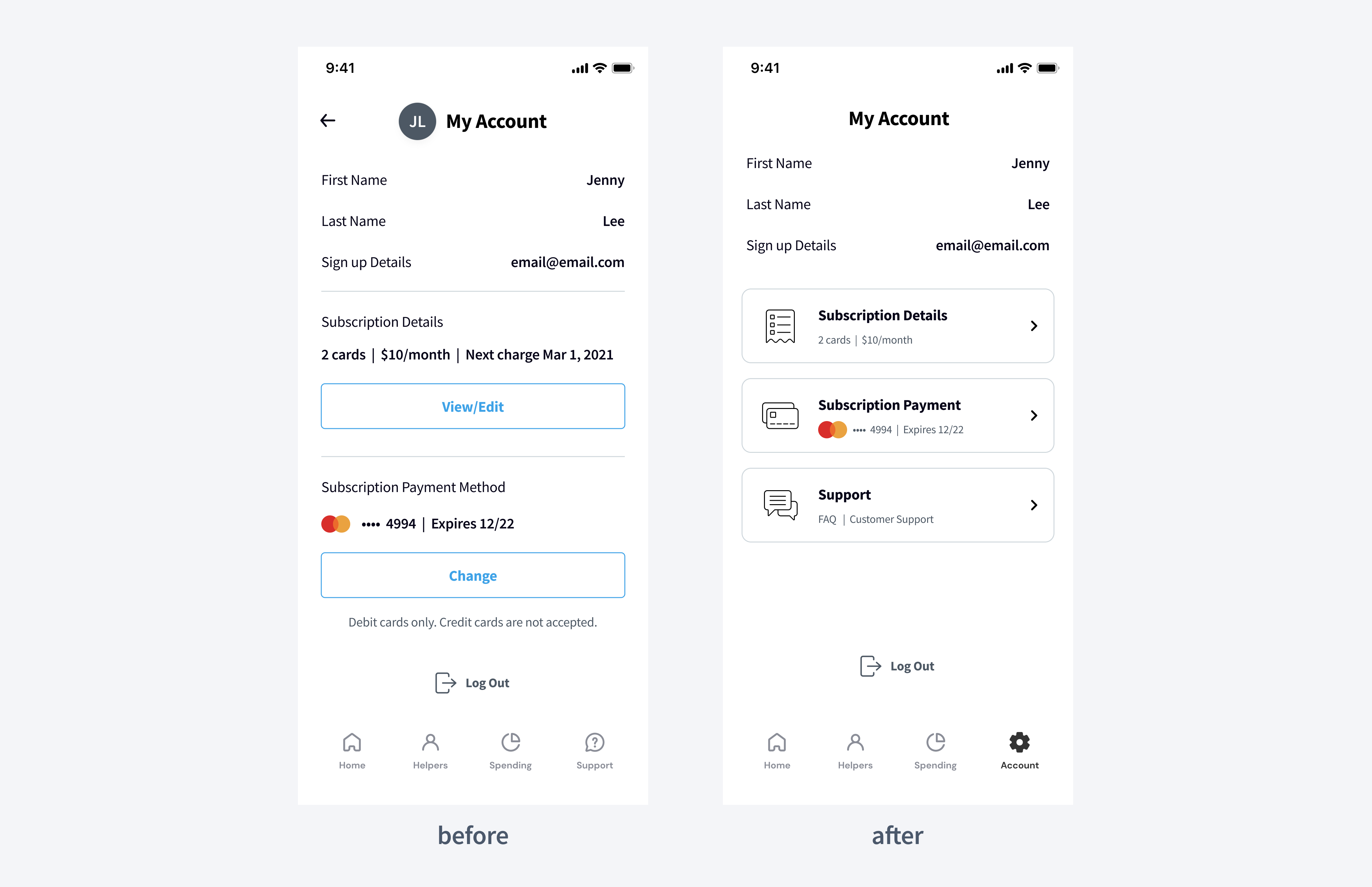
In this section we are going to show you snapshots of some screens “before” and “after” that were modified based on the results of our usability testing.
- Problem 1: it was difficult for users to find their subscription information which was in their Account (they could get to the account by clicking the circle with the user’s initials in the top left corner).
- Solution: we moved Account to the tab bar instead of Support, and moved Support into the Account page. Moreover, we changed the layout in the Account to make it clearer.
- Problem 2: users were confused when ordering a replacement card. They saw a subscription page with the new card ordered. And when they were asked to assign a new helper to this card, they tried to tap on the card plate which is not clickable except for the delete button. Prior to the usability testing, we had expected them to click ‘Back’ and then click ‘Home’ in the tab bar which turned out to be inconvenient.
- Solution: we solved this problem without additional UI. We just changed the logic a little bit. Now after ordering a new card we redirect users directly to the ‘Home’ screen where they can interact with their card — assign a new helper or activate it.

- Problem 3: most users wanted to skip the card activation step and top up the card right after ordering it. They were not able to find a ‘Top-up’ button because it appears on the card only after activation. Then they tried to tap on the card but nothing happened.
- Solution: now when the user clicks on a non-activated card, we show a pop-up informing them that the card is not activated yet and they need to activate it first.

🙌 What We Learned from Usability Testing
Usability testing turned out to be one of my most valuable experiences during the app design. As soon as you see real people interacting with your design, you start to look at the product from very a different angle.
Watching how people interact with your app is a crucial part of the product review process. Based on these results we received valuable feedback and understood how we could design JiPay's fintech app to better meet users’ needs and expectations.
Looking at your product from the users’ side can really turn your picture upside down. The Design Team will be happy to create an appealing UI and effective UX design for your product.
Together we can test all your hypotheses regarding a product or its features during usability testing. This will take your product to a new level both from UI and UX points of view.
.svg)


