3 UX Design Trends that are Hurting Your Online Business

The effectiveness of your app or site’s design and interactive features are crucial to the success of your business. It directly affects user engagement and how traffic flows throughout your content.

It’s important to have a comprehensive understanding of where your users are navigating within your site, how they get to certain sections, and which UI components are effective in driving traffic and which components are detrimental.
In this article, we will discuss the latter. Here are some popular design trends that may seem cool to implement within your website, but can actually harm the success of your business and user engagement. Unless you’ve clearly validated their necessity, you could improve customer experience and retention by ditching them.
1) Hamburger menu
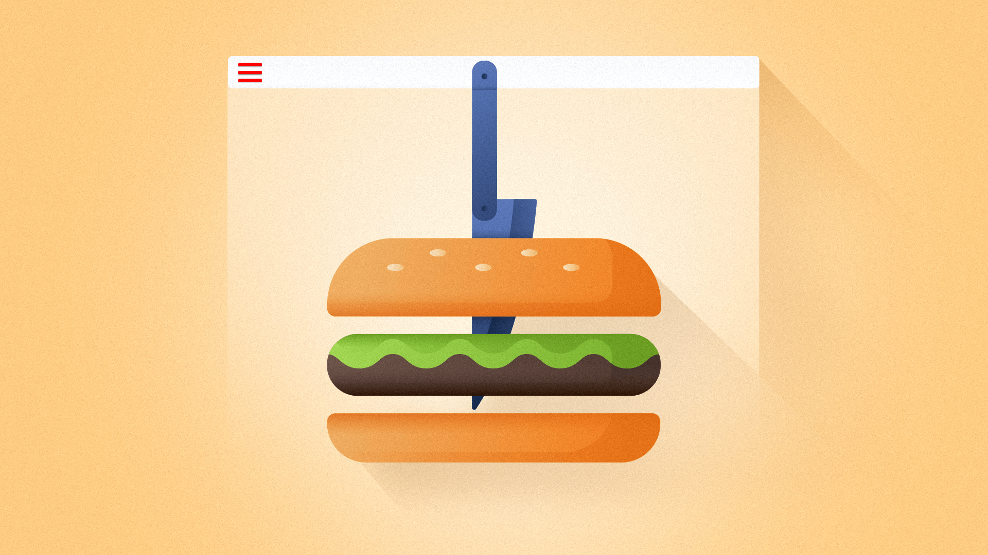
Hamburger menus have been extremely popular to implement within a website’s UI since the birth of smartphones and the rise of responsive design patterns. It is easy for developers to drop in a Bootstrap navigation bar which causes a hamburger menu to present itself by default on mobile screen sizes.
However, as much as a hamburger menu would make sense for responsive design or as a button to display a hidden side menu, it turns out that a hamburger menu is a very inefficient way to present information and features to your user.
An article titled, “Kill The Hamburger Button”, written by Josh Constine on TechCrunch, breaks down why the hamburger button is inefficient. The article highlights the phrase, “what’s out of sight is out of mind” which shows how a hamburger menu does a great job of hiding information from a user. If your customers can’t see core features of your app, they are less likely to use them at all, let alone regularly. This idea is supported by an A/B testing conducted by Zeebox, a digital marketing and technology agency, which showed that a tab bar had an 8.7% higher average daily frequency than a hamburger menu.
Why are users not as engaged with a hamburger menu as they are with a tab bar? The explanation was simply put by a talented product designer, Luis A, who wrote “Why and How to Avoid Hamburger Menus”. He shows how a hamburger menu conflicts with the overall design pattern of a site. First a user must tap or click on the hamburger menu icon, wait for the menu to transition in, only then can users see what features are available to them.
Luis also mentions how a hamburger menu may hide important information such as notifications or message alerts. This is crucial to user engagement. If you were using the Facebook messenger app and in order for you to check whether you had a message or not, you had to click on a hamburger menu every time. That would be extremely tedious and you would certainly be less engaged with the product.
Tests have shown a better solution is a persistent tab bar that puts your 4–5 key features directly in front of your customers. There were valid reasons for the hamburger menu years ago when screens were significantly smaller. That’s not the case today and app functionality has been increasingly streamlined.
So leave the hamburgers at the drive-through and give your customers a more frictionless mobile experience.
2) Forcing Users to Disable Ad Block

With the rise of ad-block users, online businesses are beginning to see a drop in ad revenue. To combat this, many sites now ask users to disable their ad blockers. Some go so far as aggressively forcing users to disable it or their website becomes inaccessible.
For sites that outright force users to disable ad-blocker or face the inability to access content; these sites are losing traffic. Research mentioned in an articled titled “Sites that block ad blockers seem to be suffering”, written by Martin Anderson, published by The Stack, showed that sites such as City AM Financial News, Forbes, and Wired all experienced a steady decline in readers after forcing users to disable their ad blockers to unlock the site. It is also stated that there may be many other factors that would result in a decline in traffic. Regardless, forcing users to disable ad blockers to access the site is not helping improve customer experience.
It’s not a surprise that people would leave a website if they were asked to take a minute to disable their ad block, especially an era of people with short attention span. What do you do when you encounter one of these popups? Do you spend the next 2 minutes figuring out how to disable all 3 of your ad blocker plugins or do you simply navigate to another site?
The best bet is to avoid this solution altogether and allow all users to flow within your site.
3) Your Content will Arrive Shortly...

Pre-loaders are graphical animations which indicate that content is currently being fetched. The purpose of a preloader is to make it known to the user that the site has not crashed and they. need. to. wait.
Seems harmless, right?
There are several reasons to avoid pre-loaders—they may slow down performance, interrupt the flow of your site, and be detrimental to the overall design. Not to mention your readers bouncing right off your site, especially if they are not highly motivated to wait for your content.
Fast load times are crucial to retaining users and pre-loaders may cause slower load times. SVGs, GIFS, or PNG file types—the most common pre-loader formats—are slow to load making it a counter-intuitive component. Pre-loaders are considered an outdated design pattern that interrupts the friction-less flow of your website’s UX design.
The guidelines for acceptable wait times date back to R. B. Miller’s 1968 report on response time for human-computer interaction. This begs the question of why it’s still a common fallback in modern UX.
Nowadays, there is almost no reason to use pre-loaders. A much better alternative— used by companies such as Youtube, Facebook, and Instagram—is a skeleton screen. Skeleton screens, unlike pre-loaders, give the illusion that some portion of data has already been loaded. That is good for user retention and works as an indication of fast performance.
Does it really work? Some studies find the benefits over-rated while others support implementing skeleton screens.
The next time you encounter the need to place a loading indicator, it would be wise to consider implementing skeleton screens instead. Fast load speeds across all devices should always be a top priority.
By avoiding these three pitfalls in your web and mobile design, you can position your online business for success. Make it frictionless on mobile, accessible on the web and highly performant for your customers.